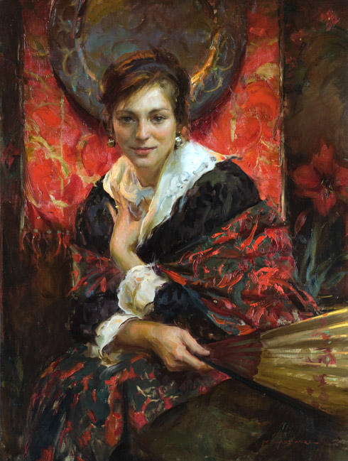
This is the eighth installment from the series of posts that will describe my thoughts and technical insights from selected works included in our newly released book, “Not Far from Home”….Enjoy!
Looking for the Abstract….
At the outset of a painting, the thread of inspiration comes and I begin by gathering the model and objects that will build the composition…
There have been times when setting up the pose, whether out of laziness, fear, or just because I have to start somewhere, I begin to arrange the elements in a predictable fashion that seems right at first, but when observed with a critical eye later, it is obvious that the attempt is lacking. I have found that this is not the time to give up, grab the brushes and paint it anyway, hoping that some flashy brushstrokes will save the weak arrangement. When I realize that my composition is too staged, or lacks the power I had initially envisioned, it is imperative that I find a way to get a fresh look at the elements in front of me before the brushes get wet. Sometimes just a few minutes away from the model can help. Then upon my return, I keep an eye on the model when they are not “posing”, looking for an unexpected turn or twist in their line that lifts me from the conventional start. Richard Schmid gave us this hint many years ago. (Thank you Richard!)
Another sure way to shake up the composition and mood is to spin the model stand 180 degrees to a backlit approach, always being aware that the right combination of shapes may appear at any point. Another would be to change the vantage point height, maybe higher, maybe lower… After all, the most important matter is that I end up with an interesting arrangement of abstract shapes that weave the eye around the canvas.
As I am surveying for a fresher look, I find it necessary to divorce myself from the literal subject to more effectively see the composition in the abstract. I have found my best compositions have risen from such an approach.
The arrangement for “Backlit Peonies”, page 75 from “Not Far from Home”, came about by such a sequence of events. The detail on the opposite page in the book further exemplifies the abstract nature of the piece… Enjoy!
“Not Far From Home” click book for more info. Thanks!


