Author Archives: danielgerhartz

Technical Insight #29…”Not Forgotten”

“Not Forgotten”

Not-Forgotten-12x24e

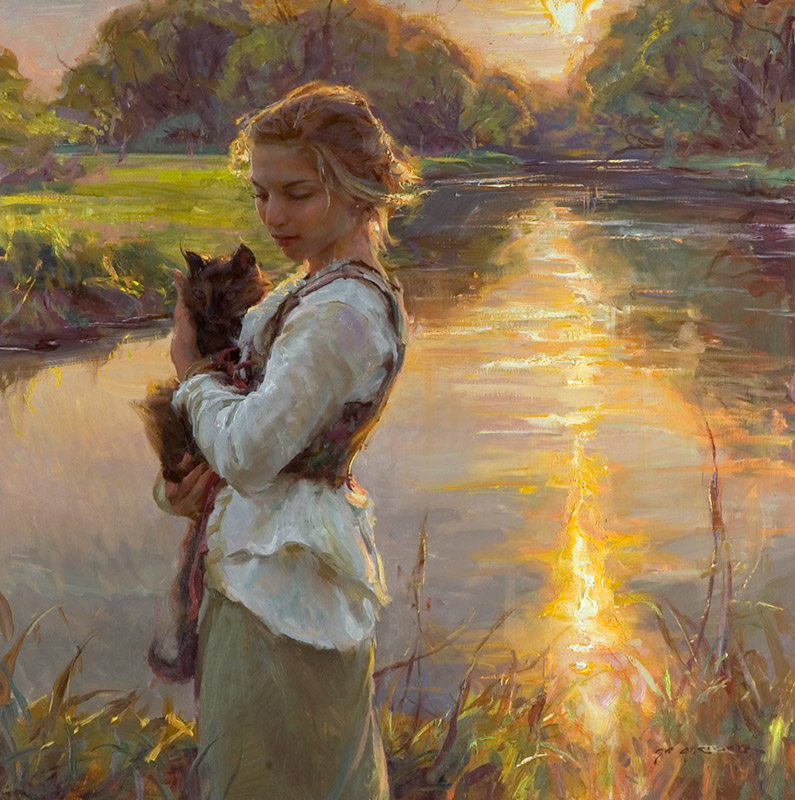
At first glance, the harmony in “Not Forgotten” would appear bleak and dreary, but on the day I stood in this cold cemetery, I found great comfort and peace in the muted tones of this oil landscape.

Not-Forgotten-detail

More often than not, I find myself most deeply moved by subjects or works of art that are the tightest in harmony. It is the Emil Carlsen still life that remains with me days after its viewing, the Chopin nocturne that seems to calm the loudness of life. Alphonse Mucha, another favorite of artist of mine, triumphed beautifully in capturing the subtlety of tone found in creation.  These artists favored quietness to bring great power.

Carlsen                                                                                                                                                      Emil Carlsen, Salmagundi Club collection

I must also add that “Not Forgotten” was painted soon after the passing of my dad. The rawness and harshness of the reality was softened that day by absorbing the richness of tone and harmony present.

I am so grateful for beauty and the healing balm it offers to our souls.  God, You are most worthy of praise for bringing beauty from the ashes.

book cover new web                                                                                                                                                                   Click book for more info…

Also available, New instructional video, “The Beginning of Autumn”.

FW-Gerhartz-DVD-cover-art                                                                                                                                                               Click video for more info…

Ten years since the release of his best selling DVD, “Her Mother’s Locket”, Dan returns in video to share his practical, accessible approach to oil painting.  During this 6-hour presentation, he brings to viewers his 25 years of experience in painting the figure outdoors, walking his audience through the hurdles and challenges that face the painter. From a thorough discussion of materials to discussions about what truly ignites his passion for painting, Dan spares nothing as he works through the process.  Beautifully filmed, precisely edited, “The Beginning of Autumn” will be sure to inspire. Great as a holiday gift idea.

Thank you!


“Rain, falling snow, wind… Technical Insight #28

In June of 1987, I embarked on my career as a full time fine artist.  Upon leaving the doors of the commercial art studio I was working at, my dear friend and co-worker Kenn Backhaus handed me a small metal plaque as a gift that has stayed with me through the years.  The inscription read as follows…

“Rain, falling snow, wind…all these things to contend with only make the open air painter love the fight.”      Walter Elmer Schofield

schofield-plaque

Kenn and I had painted together many times dealing with the elements of rain, wind, mosquitos, hail, snow,etc… trying to come up with a worthy painting amidst the adverse conditions. This plaque has been screwed to the front of my french easel for years, reminding me that the effort is always worth the fight.

We are pleased to announce that our latest video, “The Beginning of Autumn” is now available at http://danielgerhartz.com

During this production, as you will see in the trailers, we had ample opportunity to work through the elements.  In this production you will see first hand how I worked through many of the challenges that face the open air painter as well as comprehensively talking through my thought process as the painting developed.  From a thorough explanation of materials to discussions about what truly ignites my passion for painting, this 6 hour presentation afforded me the time and opportunity to share my 25 years of painting experience. As is important to me whenever I teach,  great care was taken to explain the complex points of creating a successful painting in the simplest, most practical terms.  My thanks to Masoud Habibyan for the beautiful filming and precision editing.  Enjoy and great painting!

FW-Gerhartz-DVD-cover-art

Click DVD cover for more info….thank you!


Technical Insight #27 from “Not Far from Home”…”Amethyst”

Amethyst-40x30

Concepts for paintings arrive in many ways and are derived from various sources.  Sometimes I set out to capture a certain sense of light or to develop a composition in a particular color harmony or tonal range. In other instances, I have conceptualized less before beginning.  In these cases, I design in response to a rhythm of line or the unique characteristics of a model or costume. In Amethyst, I was inspired by the dramatic arching lines of the dress and the color harmony represented in the fabric and flesh tones.  These stirring visual catalysts were accentuated by the models striking presence and beauty.

Also helpful in this set up were the models gracious offering to provide this dramatic dress.  I remember the day well…before the day began while working on another composition of an exuberant flamenco piece which she sat for as well, the model carried this dress in and asked if I might be interested in painting this costume too? My response, “Are you kidding?!!!!”

Passion-48x36

Enjoy “Amethyst” and many more images in “Not Far from Home”.

book cover new web

Other good news from the studio…we are in the final phases of proofing the DVDs and BLURAYs before replication for our latest instructional video, “The Beginning of Autumn”!


Technical Insight #26 “In Her Care”

This work, as many of my other figurative outdoor paintings do, had a hybrid approach in regards to its execution.  As always, the best-case scenario is to complete the entire work from life, but because this is not always practical as was the case in this sunset scene, one must use whatever means appropriate to simply finish the work. “In Her Care” was begun from life and entirely blocked in on location.  All of the canvas was covered from life with the accurate tones and values that carried the sense of light.   I then continued the painting in the studio to refine the drawing and work the edges to turn the forms. Having said that, one must be careful not to make it a habit of this by only blocking in the subject or taking shortcuts as a general rule of technique.  Again, your BEST paintings will be when you are absorbing all of the stimuli of your senses and allowing them to work their way into your work.  This is only possible when standing before your subject.

In-Her-Care-40x40

Because I knew that my time from life was going to limited in this work, there were several tonal transitions that I wanted to be sure to note and cover the canvas with while I was out with the subject. Some of the important observations I took note of were:

*Hierarchy in value tones.  (Sun the brightest, reflection of sun next, value of sky to follow, etc.…  Also noting the darkest dark from life. The photo wrongly recorded the distant trees almost as dark as the cat.)

*Color balance and cool influence on skin tones as they wrapped around the face and hair.

*Opalescent quality to the color in the water.

* Color balance in spring green tones. (Finding other colors within the green fields that balanced out the acid green that the photo recorded.)

*Noting the accurate color and value of the distant tree line.

This painting along with the close-up detail of the face and many of others of similar approach are depicted in our publication, “Not Far From Home”.

book cover new web

Other good news from the studio…we are in the final phases of proofing the DVDs and BLURAYs before replication for our latest instructional video, “The Beginning of Autumn”!  Things are looking great and are we are anxious for its release hopefully in a month or so.  I am sorry for the long delay since my first announcement before Christmas.  We originally planned only for a digital download release, but realized the demand for a hard disc was too great to overlook and have spent the last months coordinating the production. We hope you enjoy it!  Please see another of the trailers below. Thanks much!

Enjoy!


Technical Insights from “Not Far from Home” #25

Nichols Creek …then and now

One of my winter rituals in landscape painting for the past ten years or so has been to visit a secluded glade which my brother Steve Gerhartz  first showed me.  Steve, an accomplished artist himself, has painted this location often and has been generous in sharing where his adventurous spirit leads him. This particular “bit of paradise” offers wandering streams that spring forth from the hillside as they descend through virgin cedar forest.  Endless angles and abstractions provide ample material for intriguing and inviting designs.

The invigoration of being surrounded by such beauty and experiencing the joy in trying to capture it on canvas bring to mind what my mentor and friend, Richard Schmid, once said to me while enjoying the experience of landscape painting, “We should be arrested for having this much fun while at work”.   His enthusiasm for the thrill of painting is truly memorable.

This past week I made the pilgrimage to our favorite spot and captured the afternoon sunlight in this new work, “The Scent of Cedars”, 24 x 40, oil on linen.

The-Scent-of-Cedars-24-x-40

The technical advice for this challenging work was to keep in mind the original intent of design and light as the moving shadows and spots of sunlight created a new composition every few minutes. If I had constantly chased the moving light and added spots here and there as they shifted, the composition would have been fragmented and less unified.  I cannot stress enough the importance of keeping in mind a solid design of lights and darks from the outset.  It is always helpful for me to produce a thumbnail sketch of this pattern, or if you are tech savvy, a digital sketch of the arrangement of shapes that you may refer to as you continue in the field.

Another snow scene entitled “Spring Fed”, painted in this same forest may be seen on page 101 of our book, “Not Far from Home”.  Enjoy!

book cover new web

Just an update on the video, “The Beginning of Autumn” …  we were originally planning on releasing our latest video solely as a digital download but recently have felt it necessary to also offer it in DVD and possibly BluRay.  We are very close to production on that and hope to have things ready in a month or so.  Thanks for your patience!


New Video… “The Beginning of Autumn”

The changing of seasons has always been great source of inspiration for me through the years of my artistic development.  It is no surprise that I should draw from this source once again as I chose the theme for our latest instructional video, The Beginning of Autumn. We expect its release in mid- December.

It has been nearly 10 years since the release of our last instructional video, “Her Mother’s Locket“.  If you enjoyed our last production, I believe you will gain much from this new work as well, as I discuss many of the critical elements in creating a work of art. While the painting unfolds, I discuss first hand many of the same principles found in the “Technical Insights” and work through problems as they are presented at various stages.  In addition to addressing the common issues facing an artist with a live model, I also spend quite a bit of time sharing how I handle working en plein air (in the open air or outdoors) with a figure. Walter Elmer Schofield, the great American Impressionist landscape painter of the last century said it well, “Those wonderful things out of doors… rain, falling snow, wind – all these things to contend with only make the open-air painter love the fight.  We certainly had a “fight”, but as is always the case, it was well worth it.  As the work developed during the week, we were forced to make decisions as to how to deal with changing light, wind, and rain. While these can a bit of stress to the effort, they also add spontaneity and freshness that would have never been possible.  As we persevered, the circumstances afforded many opportunities to discuss the challenges that I regularly face when working from life outdoors.  I hope you can join me as I look forward to sharing the experience with you!


Technical Insights from “Weekend with the Masters”

Portrait Demonstrations… Weekend with the Masters


I have had the privilege of teaching the art of painting for the last twenty years or so and have chosen the portrait as the vehicle to explain the concepts because of the exacting nature of the subject, forcing the student to be precise in their seeing and drawing.

What remains my greatest challenge in the process of teaching is conveying in the simplest of terms the most direct, systematic approach to solving the problems before us.  As we stand with loaded brush before the model, so many decisions need to be made at once, often instilling panic in our hearts while we try to sort out the visual information.  Organization of thought in the beginning is paramount in the process and seems to be the only way to wade through the ordeal with any peace of mind and success in the endeavor.

“Yes, yes”, you may be saying, “but organize what?”

It has been my goal to stress the critical nature of categorizing the aspects of drawing, value, edge, and color from the outset so as to build on a solid foundation.

This needs to be accomplished before I apply paint to the canvas so I can break down the elements in a way I can wrap my head around and not be overwhelmed as the avalanche of information pours in.  So, before I begin to paint, I will make these visual observations and mentally categorize them in terms of hierarchy of value, edge, color, etc…

Value…  Look to see while squinting where the lightest lights and darkest darks are and then make a concerted effort to keep all other values in their proper range compared to the extremes.  i.e.(Not allowing the reflected lights to become too strong so to break out of the simple shadow shape or applying to many highlights to destroy the subtlety of tone.)

Edge…   When squinting, what edges emerge as the sharpest and which visually subdue to create the most variety to add power and drama to the subject.

Color… Where are the strongest colors and how do all of the others relate to them.  Also, what is the color of the light and do I see its influence on all of the top planes of the scene.

If I take a few minutes before the work begins, often it alleviates some stress and possible mistakes along the way… Keep Smiling!

These two works were completed as Demonstrations at a recent conference in San Diego.

Other news from Gerhartz Studio… we just finished filming a full length video on painting the figure en plein air that will be released in the upcoming months.  Watch for the trailer soon!

Not Far from Home is selling well (thank you)… get one while they are still in print.


Technical Insights from “Not Far from Home” #24


La Boheme and the influence of music…

My father was a classically trained baritone who sang in many choral groups that performed the works of Schubert, Brahms, Palestrina, as well as many other early gospel and early church composers.  As a child, numerous Sundays afternoons were spent at concerts soaking in the harmonies of these great works. These experiences have formed many of my sensitivities today.  As I search and strive to build compositions in my work, often I reflect on what I have taken in musically and find myself asking as the sound weaves its way through my being, “What would that feeling or sensation I am receiving from the musical harmony look like in paint”?  So the Journey begins….

This work, “LaBoheme”, inspired by Giacomo Puccini’s opera by the same title, is a tribute to how God has inspired me through music and the power that is contained within it.

Through the years, many have commented on the music that is playing in the studio and have asked for a list of some of the works.  The following are some of my favorites that have carried many inspirations. (The list is only partial at best.  Listed are only my favorite albums or songs of each artist, but often all of their work is greatly moving).

               Artist/Composer                               Album or Song

  • Ralph Vaughn Williams         Fantasia on a Theme by Thomas Tallis
  • William Ackerman                  Conferring with the Moon
  • Arvo Part                                  Te Deum
  • John Rutter                              Requiem
  • Vassilis Tsabropoulos            Chants, Hymns and Dances
  • Giacomo Puccini                      (All of his Operas)
  • Josh Groban                             Mi Mancherai
  • Connie Dover                           The Wishing Well
  • Allison Krauss                          A Hundred Miles or More
  • Henryk Gorecki                        Symphony #3
  • Patrick Cassidy                         Irish Film Orchestra  (Famine Theme)
  • Itzhak Perlman                         Theme from Schindler’s List (John Williams)
  • Yo Yo Ma                                   The Music of Ennio Morricone
  • Eleni Karaindrou                      The Weeping Meadow
  • Fernando Ortega                       The Shadow of Your Wings
  • Dave Gerhartz                            Hear You Call
  • Hayley Westenra                       Quanta Qualia
  • Rodrigo                                       Concerto De Aranjuez
  • Joshua Bell                                 Romance of the Vioin
  • Loreena McKennitt                   Nights From the Alhambra
  • Nightnoise                                  A Different Shore
  • Oscar Petersen                           Night Train
  • Over the Rhine                           Happy to Be So
  • John O’Conor                              15 Nocturnes
  • Sarah McLachlan                        Afterglow
  • Secret Garden                             White Stones
  • Sons of Korah                             Shelter
  • The Tallis Scholars                    Lamenta
  • Van Morrison                             Poetic Champions Compose
  • Gabriel Faure                             Requiem

This is a sampling of my favorites…I did not include many of the more well known classical composers, of course, they would be on the list too.

I’d love to hear some of your favorites too…

Thanks and Enjoy!


Technical Insights from “Not Far from Home” #23


“You want me to use what color on her face????”

So often as I am demonstrating painting a portrait, students are surprised by the fact that black is one of the essential pigments I use in mixing the flesh tones on the light side of the face.  In most lighting situations, the visible play between soft greens, ochres, and pinks seem easy enough to identify, but the question arises as to what pigments should be mixed to capture these tones. So often in striving to achieve the greener tones, students and (myself included early on), would reach for the viridian or sap green, only to overshoot the target and end up with colors too rich for the environment. In studying the works of John Singer Sargent and Anders Zorn, I was made aware of the sensitivity of tone by mixtures of ivory black, raw sienna (or yellow ochre), and white for the cooler tones I was seeing. This beautiful portrait by Sargent clearly illustrates the power in reserve of color while his gorgeous, liquid strokes melded the forms to bring forth an amazing lifelike feel.

John Singer Sargent

“Scarlet”, on page 99 in “Not Far from Home”, is one of my paintings that clearly drew from this inspiration in color mixing and tonal control.  I must say that there are a myriad of ways to key a painting and infinite variations of mixes to achieve a similar effect; the above simply describes my path.

I will again take this opportunity to encourage you to copy the masters works, not to profit or plagiarize, but to study and greater understand the sensitivity with which passages and transitions in tone can be made.  You need not copy their work in entirety, but just the aspects that you are struggling with. I have found that I can look at their works for hours and only see in part the subtlety, but when I physically mix the transitions in paint, I better understand the true nature of the color relationship.

I wish you joy and success in the journey!

“Not Far from Home” continues to receive great reviews…

“I pull out your book each time you post a “Technical Insight” and am either reminded of a lesson or learn a new one. This post for me makes turning the form with color temperatures very clear.

Your book is such a treasure, a masterpiece inside and out!“….Laura Albiento

Thank You!


Technical Insights from “Not Far from Home” #22

Glow On a winter evening a few years ago, Jennifer and I attended a party recognizing and celebrating the album release of a friend’s music. The event was beautifully staged and in contrast to the cold, dark night, the warm candlelit environment they created was breathtaking and somewhat otherworldly.  As an artist, my only regret from the evening was that I couldn’t capture the effect on canvas.  From a practicality stand point, I knew I couldn’t ask the hosts to leave their house in disarray for weeks so that I could paint from life, so not to be deterred and let the inspiration slip away, I arranged to recreate the mood in the studio. During the following week, our friends who served the party agreed to model, the food and candles were gathered, and the work began. Among the most challenging aspects in capturing this festive gathering in paint were:

  1. Not burning the studio down.
  2. Establishing the lightest lights and holding the key, specifically not allowing any of the lights in her white apron to supersede the candle’s glow.
  3. Getting enough light on my canvas to see while the models remained in the darker candlelit space.
  4. Achieving a balance of color temperature throughout the canvas.  In an overwhelmingly warm light source such as candle glow, the tendency is to only paint the obvious warmth of the light.  I was again reminded that it is the introduction of the complement that accentuates the warmth and strengthens the forms.  Remember to look for the complete balance in all areas! In this case, it meant finding the cool tones in the models skin and clothes, the candles, the tablecloth, the artichokes, etc., etc….
  5.  Arranging the candles in an interesting line to create negative spaces between them that were as interesting as the candles themselves.
  6.  Creating variety in the candle flames so as not to be to repetitive in the shape, value and color.
  7. Coming up with enough jokes to keep the models smiling for days on end.
  8. Not burning the studio down.  🙂

Enjoy!!!Thanks for considering “Not Far from Home”…

book cover new web