Category Archives: Painting People

Technical Insights from “Not Far from Home” #19

Vibrant

As I began to decide on the composition for this work, the question arose in my mind, (as it always does when staring at a white canvas), “How can I make this work unique”, or, “How can this portrait, not appear as just another stale, predictable depiction of a pretty girl.”  Many different elements may have been used to achieve this end, whether it is limiting the palette of colors, pushing the key or value range into something far more moody, the unusual cropping of the figure, or other various methods.

In this case as I was moving the lighting around the model trying to reposition things to get a fresh look, I noticed the striking abstract created by the model’s face against the lighter background.  This technique is certainly not original with me, as I have seen the great illustrators of the past employ this effect beautifully. The works of Frank Brangwyn and Dean Cornwell stand out in particular.  Notice how the figure or heads are not immediately visible but rather are part of the greater compositional whole.

Dean Cornwell

Frank Brangwyn

The lights and darks follow the pre-established patterning and flow of connected values.  The strong abstract pattern was most important to them.  This, too, should be just as important to us.  My take away from these masters  has been to try to see the subject in the abstract more than just a literal portrait  on canvas.  My former teacher Bill Parks would fill dozens of sketchbooks with 2” x 3” designs just to explore the infinite variety within shape and size juxtaposition.  He often mentioned that the painting should just as interesting at 50 yards away as it is upon close inspection.  His voice is still ringing in my head… how grateful I am for his tutelage.  I must mention that in addition to Bill’s voice, Jennifer’s parting words as I am heading for the studio are often, “Design, Design, Design”… for her reminders I am grateful as well.   😉

book cover new web

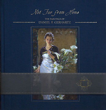
Click Book for more details…Thank you!


Technical Insights from “Not Far from Home” #16

Resolutions

As I am anxious to start the new year with it’s hopes, dreams and new beginnings,  I am reminded of how on a smaller scale to the artist, a fresh white canvas offers hopes and dreams all on its own.  Just as in life we see the importance of looking back in review to more effectively move ahead, I am reminded of the necessity to treat each new canvas with the same degree of serious reflection so as to learn from the last attempt.
Each painting must begin with a resolution of sorts, to improve upon a deficiency in edges, value, drawing, or color to greater achieve the mood you are aiming for. I am continually striving to get to the next level and have found that it clearly helps to have a plan formed before the brush hits the canvas.  Be specific. Resist thinking, “I hope this one turns out better”, but rather meditate on, “What specifically do I need to work on to gain greater sensitivity or strength in my work”.  If you have trouble identifying what that might be on your own, ask someone you trust to tell you the truth.  I am extremely dependent on “outside” help.  My wife Jennifer has an amazing eye and often sees what I miss.

I remember specifically the resolution I made prior to this painting, “Tricia”, page 33, that being to severely limit my color palette.

My work had become too colorful, meaning I was using color for color’s sake, throwing it in haphazardly and not being truthful with what I was seeing. The “circus” look was not working!!!    Having recently viewed an Anders Zorn exhibition helped me to identify this color problem and I recognized that something had to change.  As an exercise, this work was completed using his choice of colors as well, that of, white, black, raw sienna, and Rembrandt’s Permanent Red Medium, (which closely resembles the vermillion Zorn used.  I have since broadened my palette again, but the lesson was invaluable to teach me what effects could be achieved with very little shift in color.

I wish you great paintings as you break out into the New Year!

book cover new web

Thank you for your enthusiastic support of Not Far from Home!


Technical Insights from “Not Far from Home” #13

Coffee

The work of the great pioneers in the art of photography have long been a true source of inspiration for me and have been a driving force in my design sensibilities.  Studying the simplicity and solidity of their compositions has had a profound impact on the way in which I view my subjects and played significant role in the composition of this painting,“Coffee”, (page 30) .


As I was surveying the subject while deeply squinting to prepare my approach to this work , I could almost see the veiled effect of light that the early photographers so keenly captured.  This “veil” softened the forms while pulling together the values, simplifying the shapes and created strength in the design that would have been lost had the shapes been broken up by more value transitions.

The challenge at hand was  to continue to see the elements in their simplest essence, so as not to disrupt the simple masses and to create a connected design with the lights as they weaved through the dark background.

While modeling the detail within the larger shapes, the photographs of Clarence White and Edward Steichen whose bold graphic shapes and simplified value patterns flashed through my mind as I continued the work to completion.

While ” Coffee” was the first of many works that had this influence, many more of the works within “Not Far from Home” were created in a similar fashion.  Some include, “Leica” (page 112) , “Scarlet” (page 99) and “A Simple Gift” (page 95).

Blessings…

book cover new web

Click Book for more info…thank you!


Technical Insights from “Not Far from Home” #9

This is the ninth installment from the series of posts that will describe my thoughts and technical insights from selected works included in our newly released book, “Not Far from Home”….Enjoy!
Working with models…
One of the peripheral joys of working from life for me, aside from the ability to witness the breathtaking light first hand as it descends on the model, is the privilege of enjoying the company of another human throughout the course of the day.
Part of that privilege has been the process of working with the same model over the course of many years, recording their lives from children into adulthood. Such is the case with several people from our community. The following photos show one such daughter of a dear friend who first sat for me at age nine and still poses for me today, years later.


There is a comfort and ease that works its way into the paintings that would not be present if the nervousness of the first sitting were always obvious on the models face. Nothing can be faked. I have tried to paint a relaxed mood that was not actually present on the models face many times only to wipe it out time after time. What I see is what will show in the end. While working with a familiar friend, I also find it somewhat of a relief not to have to make excuses for all of the idiosyncratic maneuvers I do as I prepare for the days work, whether it be the pacing, circling, sighing, designing and redesigning the set, or to once again answer the question, “Why are you squinting so much”?
Another bonus I have noticed in working with the same person repeatedly is the desire to avoid redundancy in the poses. As I am working with the same person, I am forced to come up with new concepts, whether it is in design, lighting or costume. During my studies of the masters, I often noticed the repetition of the same models as well.  John Waterhouse, John Singer Sargent, Carl Von Marr, Abbott Thayer,and of course Wyeth’s Helga to name a few.

This last photo is one of the latest paintings I have done of the same gal, almost 10 years later.  As you can see, she still loves cats!  As I scanned the pages of “Not Far from Home”, I noticed that there were 16 images of her…see if you can find them all!

book cover new web

For more info on “Not Far from Home”, click book.  Thanks!