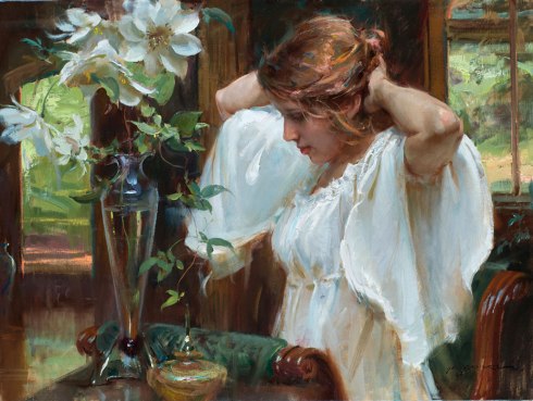
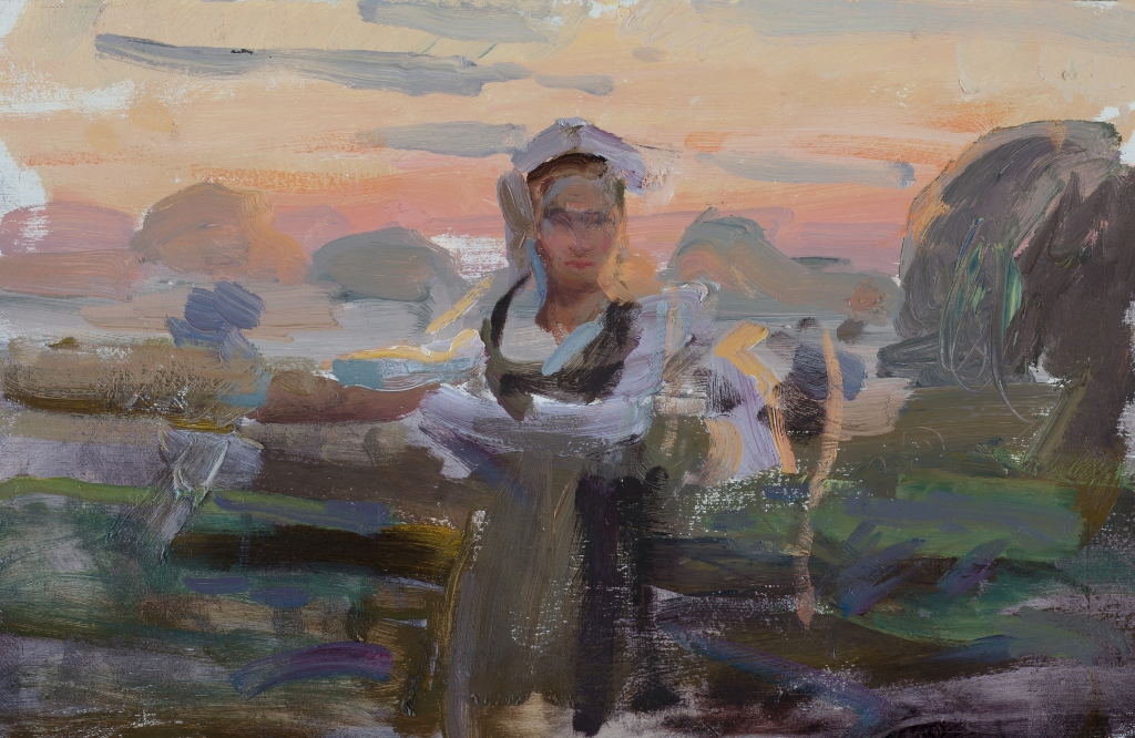
So often I have been asked if I utilize photography in my painting process. The short answer is “yes”, but I always add the qualifier, “If I must paint from a photograph, I find it absolutely ESSENTIAL to have done a color study from life”.

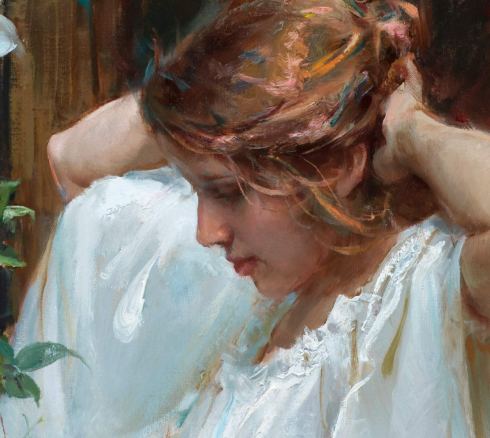
Color Study, “Last Kiss of Sunlight” 24″ x 12″
Implicit in this answer is the fact that I will try my hardest to develop the piece from life, but sometimes, it is just about impossible to do that. Whether it is working with moving animals or very small children, using a photograph adds sureness to find the drawing in the complicated forms. Another exception is working with very late or early light that has a working period of about 10 minutes before the whole tonal range has shifted to another key. Again, I will often try to make this work by making multiple visits, but this too has its practical limitations.
(Thanks for the photo Terry!)
Recently, we hosted a painting workshop in which I had the opportunity to share my methods of developing a study and then working up a finished studio painting from it. We discussed what was beneficial in the photo and what not to trust. (Basically, I used the Field Study for the color and value reads and relied on the photo for most of the drawing, adjusting the foreshortened figure, etc…) I would encourage you to implement this method in your own work. The extra time chasing the light in the study will pay dividends in your final work! Not only will the physical study be necessary in completing the finished painting as you make value and color judgements, but you will also have the opportunity to fill your senses with the ambience of the experience which ALWAYS seem to work their way into the final work. I wish you joy and success in your efforts!

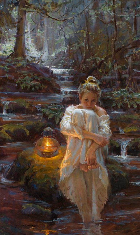
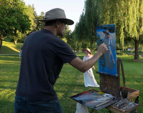
“Last Kiss of Sunlight” 36 x 24 Framed by http://jsgildedframes.com
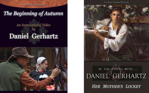
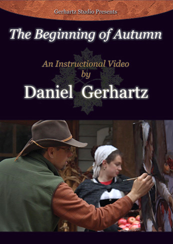
For those interested in further explanation, I have taken the time to extensively describe what I look for in the subject when working from life in our DVD’s. Click image to see more… Enjoy!

Thank You!